
From My Portfolio: Project Higher Ed
So I’m starting a new series called, “From My Portfolio,” where I share the process and stories behind the design projects that I complete. I love learning about my clients’ stories and the reasons why they started and I love giving my audience a behind the scenes look at my process. So I figured this would be a great addition to my blog! To kick it off, I’m starting with Project Higher Ed!
Project Higher Ed is a non-profit organization, based in Chicago, that provides youth and teens with help to prepare for the college admission process. It was founded by my client, Veleda Simpson. She had the idea to start the organization when she was preparing her daughter to pursue college. She discovered that there was so much to the process of getting into and financing college that many parents and students in the Chicago area were unaware of. This is all too common in the inner city areas in America, so I truly admire the fact that Veleda not only noticed this problem; she decided to do something about it.
Veleda started with a pretty standard Wix website and she came to me wanting to vamp it up with a website that would better showcase the organization and the cause. We started with a consultation call, so we could speak and get on the same page about what she wanted. We discussed the vision for her organization, what the organization stands for, the target audience, and preferences on design. This call was crucial to laying the foundation for the project.
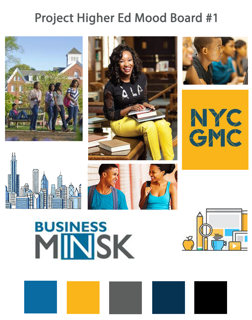
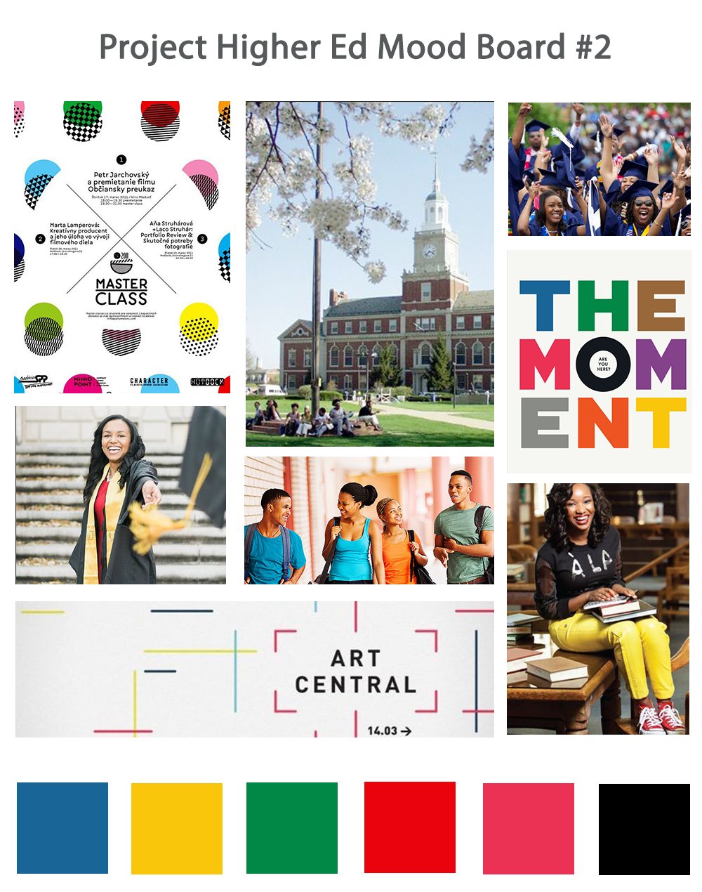
Once we finished this, I designed the mood boards for the project and I created the wireframes for the structure for each web page. I also created custom logo designs. I presented her with the two mood boards below and she chose mood board #2.
Next, I created a brand style guide and finalized logos, shown below. This provided a guideline on the fonts, colors and decorative touches, like buttons and social media icons that would be used for the overall branding, on both the website and in print brochures.

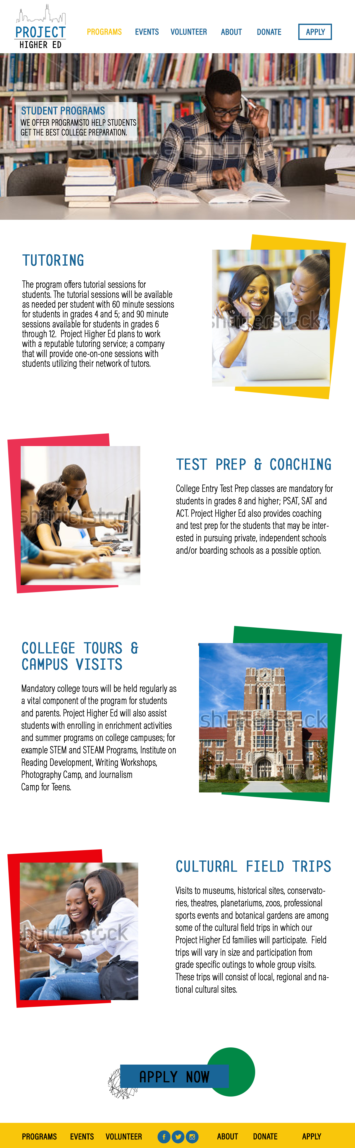
Once the design plan was in place and approved by Veleda, I worked on filling in the wireframe templates that I created for each page on the website. I started to tackle the most challenging part of the process, which was finding stock images that fit the mood of the project. Eventually, I found all the photos that we needed, so I filled in the templates with the words in the designated fonts and colors and the stock photos. I used Photoshop to create images of these mock ups. Here's one of them below.
Once I finished this, I sent them all to Veleda for her approval. She was happy with the designs and I moved on to the next step of building the website in Squarespace. I love using Squarespace because it saves so much time, but it’s still customizable to fit clients’ needs. Once I had it all done on Squarespace, I tested links, made sure the alignment on all words and photos looked good both on a computer screen and on mobile (major key because most internet browsing is done on mobile these days!), and then I scheduled the final review phone call. Veleda and I actually spoke several times throughout the process to be sure we were on the same page with her vision and preferences. I wanted to be sure the process was a seamless as possible and being accessible through those phone calls made a difference.
During our final call, I did a screen share to walk her through the process of making updates to the website and then I handed it off to her! This project was so much fun to me because it was more than just doing a website. It was creating a place on the web for a purpose-based organization to communicate with the people whose lives they are making a difference in. To see the website in action, click here: https://www.projecthighered.org/. Or you can click on the screenshot below.

I'm also proud to share this amazing feedback from Veleda!
"If you are looking for a website designer with style and pizazz, I highly recommend Keshia White!!! Working with Keshia on my startup business web design was easy and economical. Keshia is extremely creative and has a very artistic eye. She was very professional and asked great questions which enabled me to share my vision for my website. Not only did she design a beautiful site, she also created a logo that I absolutely love. I am very thankful that I found her and am happy to serve as a reference for anyone who is serious about creating a website with a modern look that is easy to navigate."
If you’d like to book me for your website, please contact me here and we can set up a free consultation call. I’d love to help you bring your vision to life online, too! :-)