7 Female Entrepreneurs with Beautiful & Effective Websites
I love a beautiful website! It's so much fun for me to admire the strategy and aesthetics of the websites of other bloggers and businesswomen. Everyone starts with a blank slate, so to me, it's interesting to see the beautiful outcomes that everyone comes up with.
Over the years, I've learned that there are a few key elements that make a website beautiful and well-designed. Here they are below:
1. Clean and uncluttered
One of the things that I hate most is a busy and cluttered website. When a website has too much on it, it literally makes my head swim and I feel overwhelmed when I have to think about what to click on. Websites like that are very ineffective. People think they're doing a good thing by giving visitors "options," but giving people too many options just doesn't work in anyone's favor.
2. Easy to navigate
Websites that are designed well should guide users from one thing to the next, with hierarchy of the most important information or actions at the top of the page. People shouldn't have to "work" to figure out what to do next or what to click on. It should be obvious and effortless for them.
3. Design consistency
Consistency in the design of a website is needed for photography, fonts, and colors. Some websites mix their fonts, colors, and photos up so much that you feel like you're looking at several different websites in one. Consistency in branding and design helps to make a website more polished and professionals.
4. Clear calls-to-action
Don't ever design a website that doesn't include prominent call-to-actions that are easy to see and click on. You should know what actions you want people to take when they visit your website and design it strategically so they'll click on them. Some examples of calls-to-action include: directing people to sign up for an email list, encouraging people to fill out a request to book your services, or promoting affiliate products to influence people to make a purchase.
5. Clear and quick articulation of benefits
Last, but not least, a website should clearly articulate the benefits that you're providing as a business owner. This could be done with a tagline, a quick summary about your business, etc. You want people to know how they can benefit from your content and services upfront. This is what helps keep them around for more.
Below, I share 7 websites from female entrepreneurs that are designed beautifully and strategically. They all incorporate the 5 elements that I listed above. Click on the photos to view each of their websites in full.
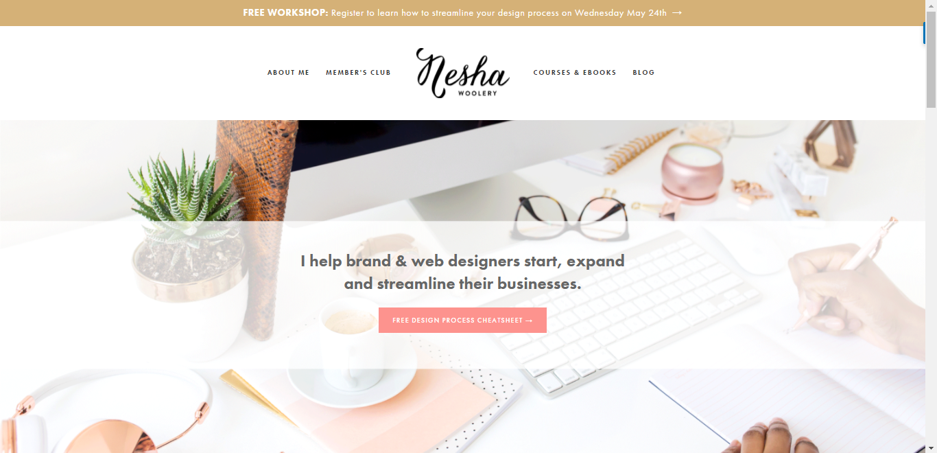
Nesha's site is beautiful and clean and super easy to navigate. I love how simple her homepage is because it isn't overwhelming visitors with too many options. She just includes her main calls-to-action, a little snippet about her, and that's basically it. For more details, you can easily click through to other pages, using the buttons and links that she positioned well on her site.
Rekita Nicole
Rekita's website is bright and fun! It shows a lot of her personality and she incorporates some unique branding elements, such as the polkadots in certain areas. Her website shows that she's targeting people who are also into colorful branding.
Elle & Company
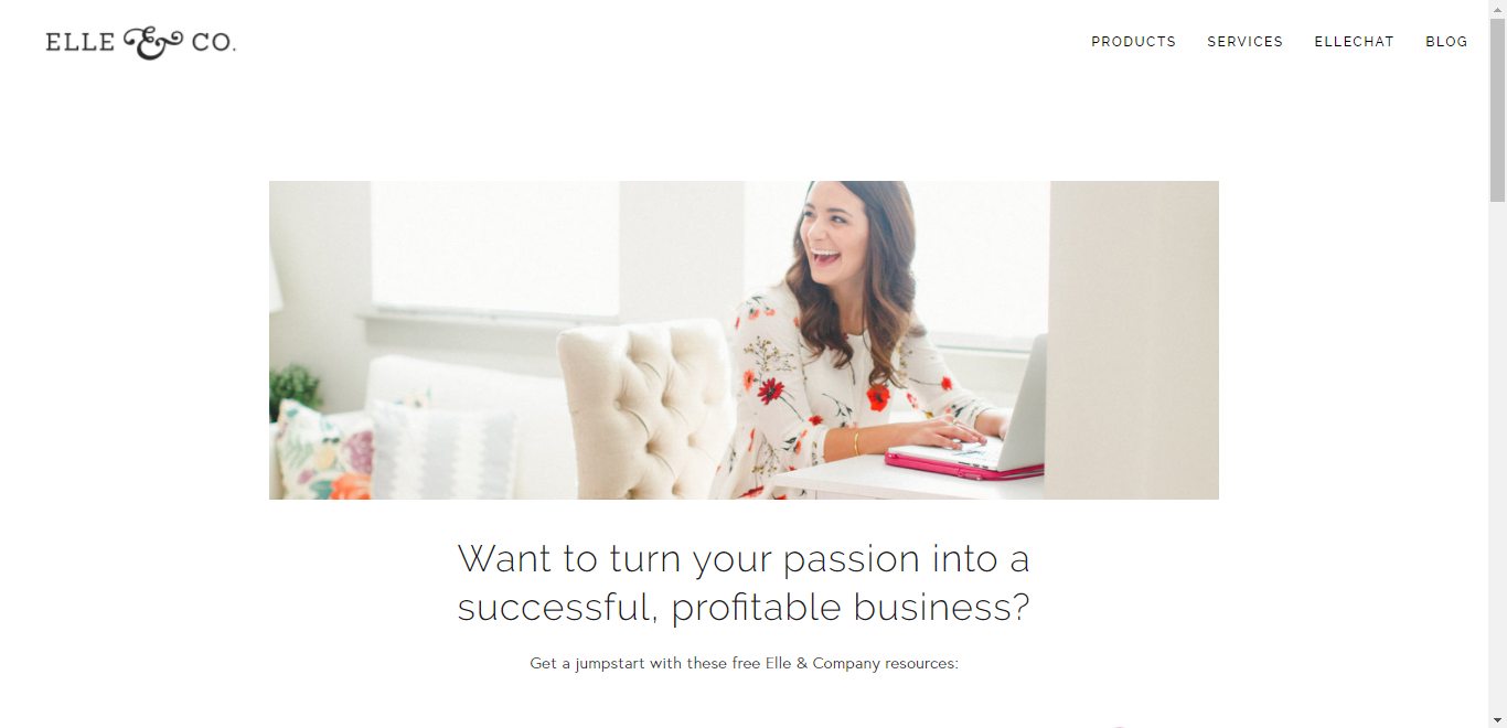
Lauren's website is beautiful and straight-forward. I love how simple it is, with the main options for what to do when you get to her page, clearly laid out. It's super-easy to understand and navigate.
Mattie James
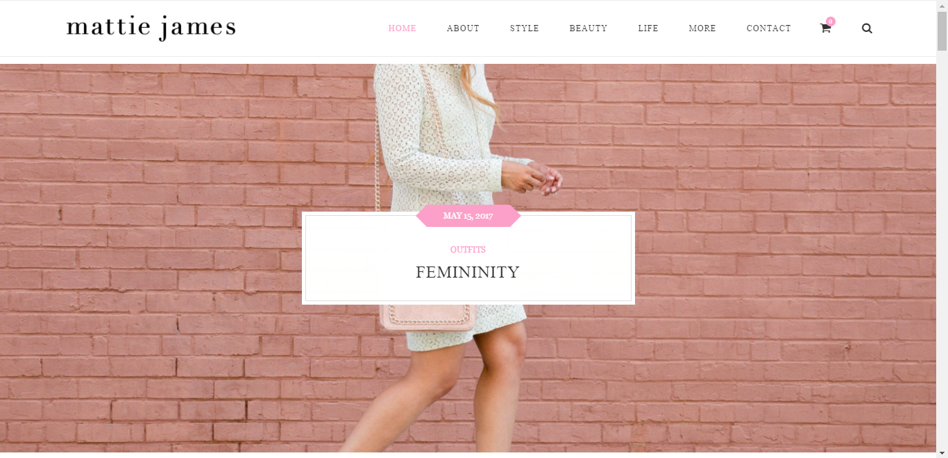
Mattie's site has a cool, very organized and clean layout. It's very editorial with the great photography and the nice attention-grabbing headlines for each of her blog posts. The posts are organized well in categories and in an eye-catching layout.
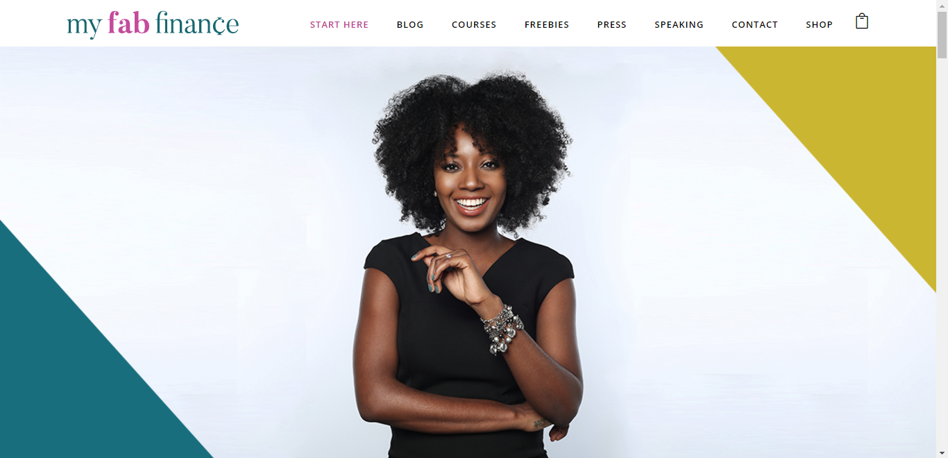
My Fab Finance
My Fab Finance is bold and captivating. I love this bold intro photo on her home page. It makes you want to scroll down to see what her site is all about. It's also great that she guides website visitors with the start here option on her navigation bar.
Debt Free Black Girl
Debt Free Black Girl is bold and easy to navigate, while having fun with color. I love the unique visual elements with the graphics and everything is modern, yet chic. It's a great take on a website about finances for women.
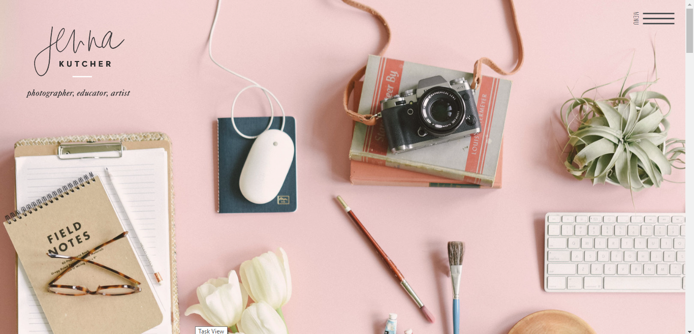
Jenna Kutcher
Jenna's site is modern and shows a ton of personality. Since she's a photographer, the site does a great job of showing off her photography work, while adding unique visual interest. You can see her personality oozing off the page with the way she writes, as well.
What are some of your favorite websites? Share them in the comments! If you want tips on making your website easy to navigate, be sure to download my free guide that will walk you through how to do it! Just click the banner below.

