4 Examples of Good Font Pairings
In this post, I wanted to provide a few examples of some font pairings that work well together. Pairing fonts is truly an art and it takes practice to become good at it. However, it’s certainly not impossible to learn with a little research and some trial and error. With time and effort, you'll be able to create font pairs effortlessly that articulate your blog or business in the perfect way.
“With time and effort, you’ll be able to create font pairs effortlessly.”
Check out my examples of good font pairings below for some inspiration.
Feminine
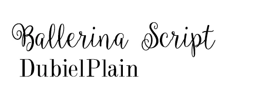
This font pairing is perfect for a fashion or lifestyle blog or even a boutique. The script font gives it a feminine look and feel and the complimentary font resembles the "Vogue" magazine font, which hints at a sense of high fashion. Ballerina script can be found here and Dubiel Plain can be found here.
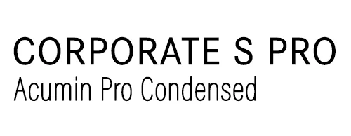
Neutral, yet Modern
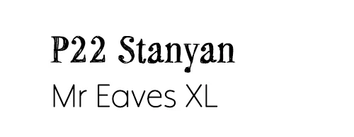
This font pairing would work well for any content that focuses on children, such as children's book, children's websites, etc. The sketched, informally handwritten feel of the first font has a strong sense of youthfulness to it and the complimentary font works well because it has soft curved lines, that gives it a more casual, youthful vibe. You can find P22 Stanyan here and you can find Mr Eaves here.
Rustic and Homemade
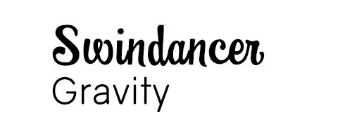
This font is great for something that's casual and and relaxed, such as a food blog or even a bakery. It has an accessible and "homemade" vibe to it. This "less-feminine script font" works really well with the complimentary font that's a lighter weight with soft curves, so it works well. You can find Swingdancer here and you can find Gravity here.
Want to get a head start on choosing good fonts and colors for your brand? Then be sure to download my free worksheet that will walk you through the top questions that you need to ask yourself to get started!


