How I Design Strategic Sales Pages in Squarespace
When I created my first digital products, I had no idea how to present them on my website in a compelling way. I knew how they would benefit buyers, so I at least had some good phrases to describe it, but I wasn't sure how exactly I'd lay out the sales pages in the most strategic way.
Luckily, I came across this template from Amanda Genther that overviews the information that should be included in a sales page. This template made it super-easy for me because then all I had to do was fill in the information with my information and images. Below, I included the elements that I incorporated into my pages, along with screenshots for how to do it on Squarespace. Having a sales page that's well-thought-out is crucial for getting more sales.
“Having a sales page that’s well-thought-out is crucial for getting more sales.”
Banner Image
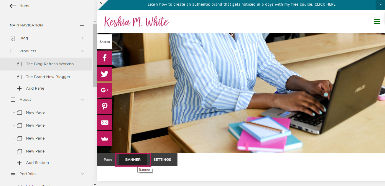
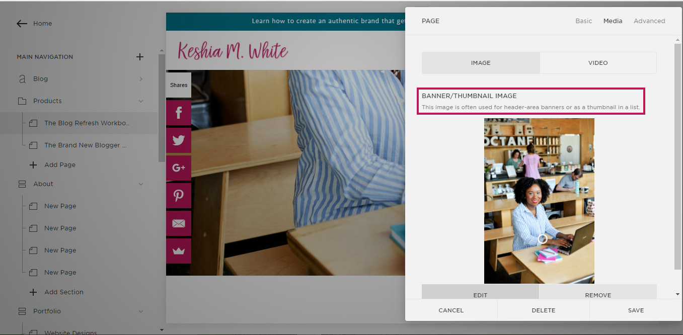
My first must-have was a nice banner images that related to the digital products. I'm using the Hayden template in Squarespace, and it has the banner image feature built-in. You can choose not to upload a picture to go without a banner image or you can upload an picture to have one.
Since I’m teaching blog design information for the two workbooks I have now, I included photos of me on the computer as the attractive banner images. To me, having these at the top, helps to communicate a sense of professionalism from the start.
Text Boxes
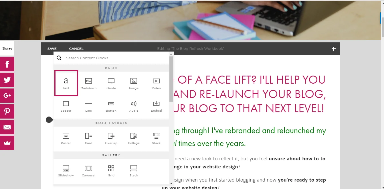
Next, you’ll want to include text. For the most important text, I used Heading 1 font. For other headlines, I used Heading 2 font, and for paragraph text, I used the Normal font. I used all of these as needed, throughout the page, based on how much information I was including and how important the information was.
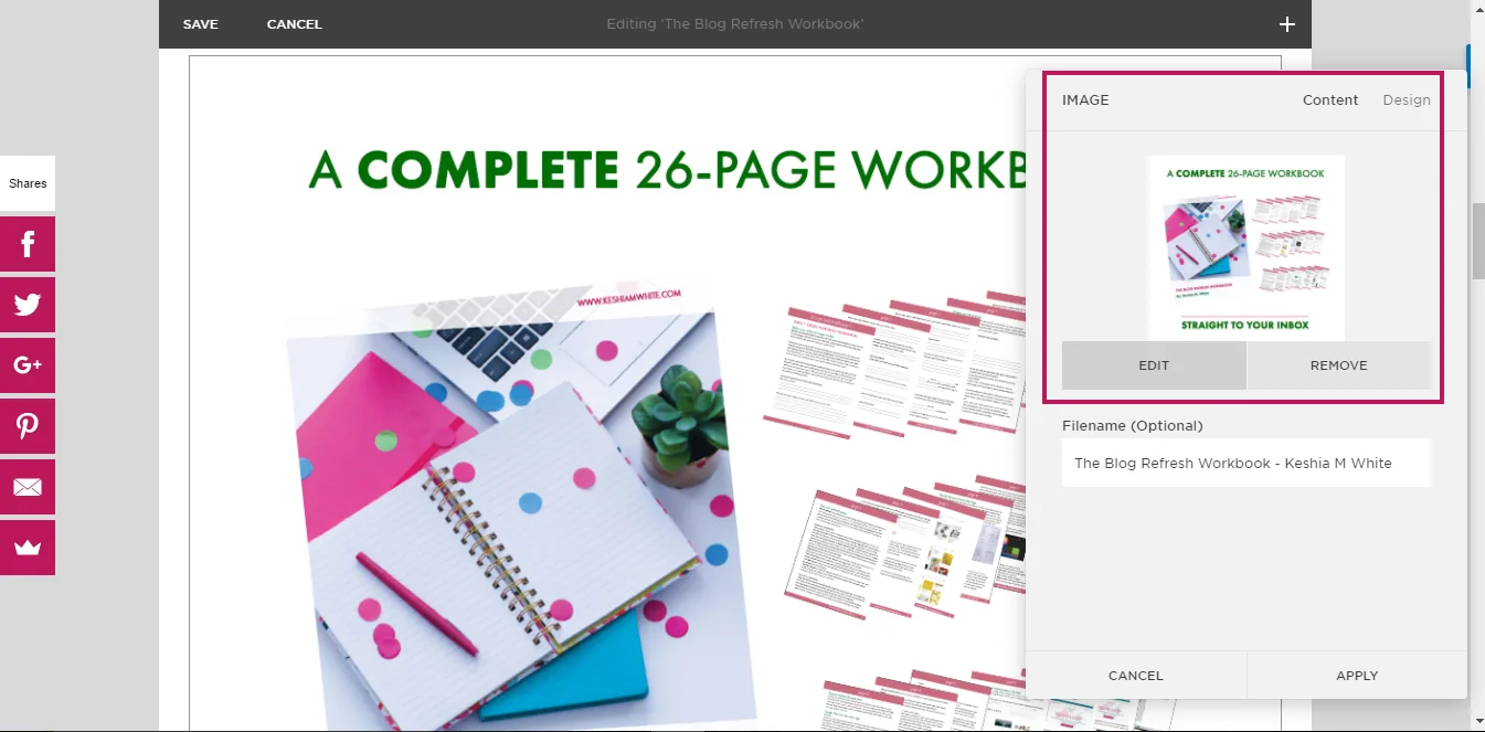
Photo of the Product
You’ll also want to include a photo of the product. Since I have a digital product, I included a simple graphic that I made in Photoshop with the cover of the workbook, the pages, and a couple of one-liners that overviewed what they are getting with the workbook.
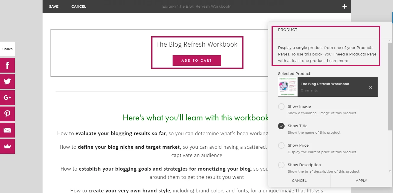
Add to Cart Buttons
The add to cart button feature is Squarespace is a perfect Squarespace hack that can literally be used anywhere on your website. This means that you can place them anywhere within your sales page, with or without the price. So this means you can easily insert them multiple times to give people several options to purchase.
Related: My Favorite Squarespace Hacks
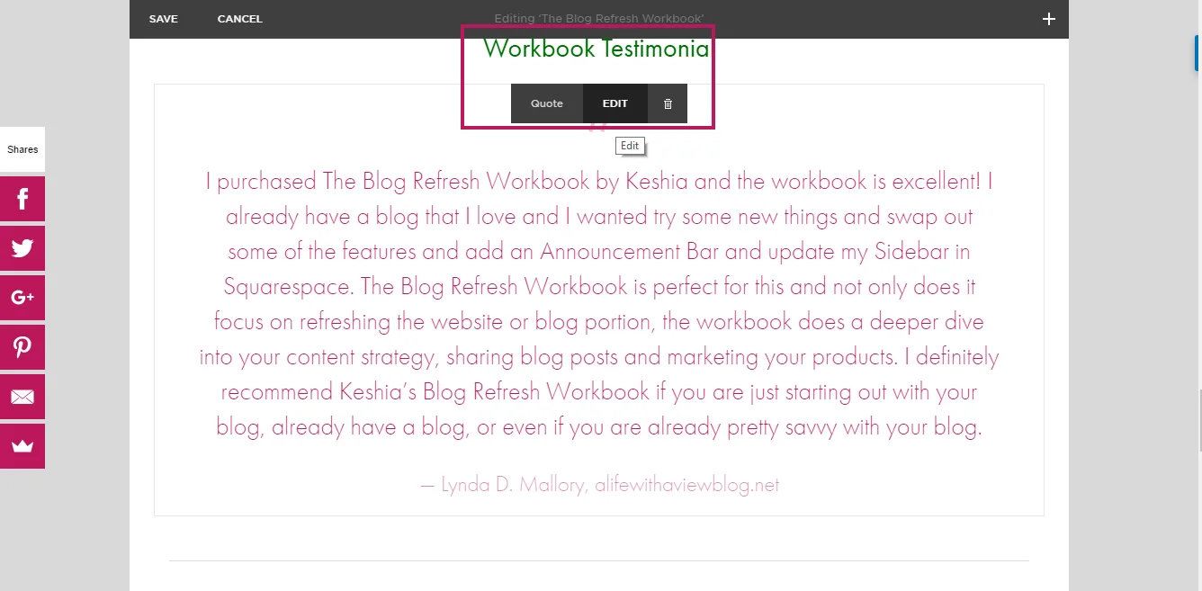
Testimonial
Once you get a testimonial on your product, it helps your credibility to include that testimonial on your sales page. With Squarespace, you can easily do that in a quote box or a text box.
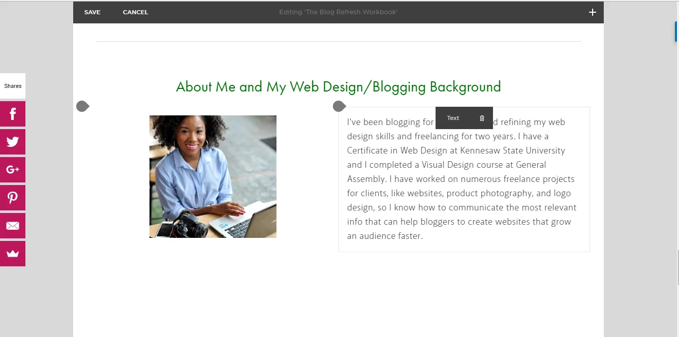
About You
Finally, include a section with a few sentences about you and what makes you qualified to sell your digital product. It’s also good to also include a photo of yourself “in your element,” like in your home office, or if you’re like me and you don’t yet have an home office (soon come!), you can include a photo of you in one of your favorite coffee shots where you like to work.
And there you have it! You’re all ready to have a sales page that communicates well and looks beautiful! Happy selling!

